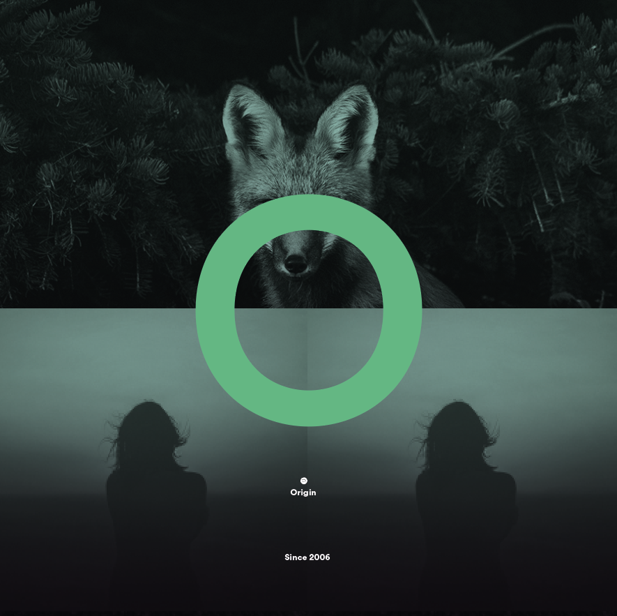
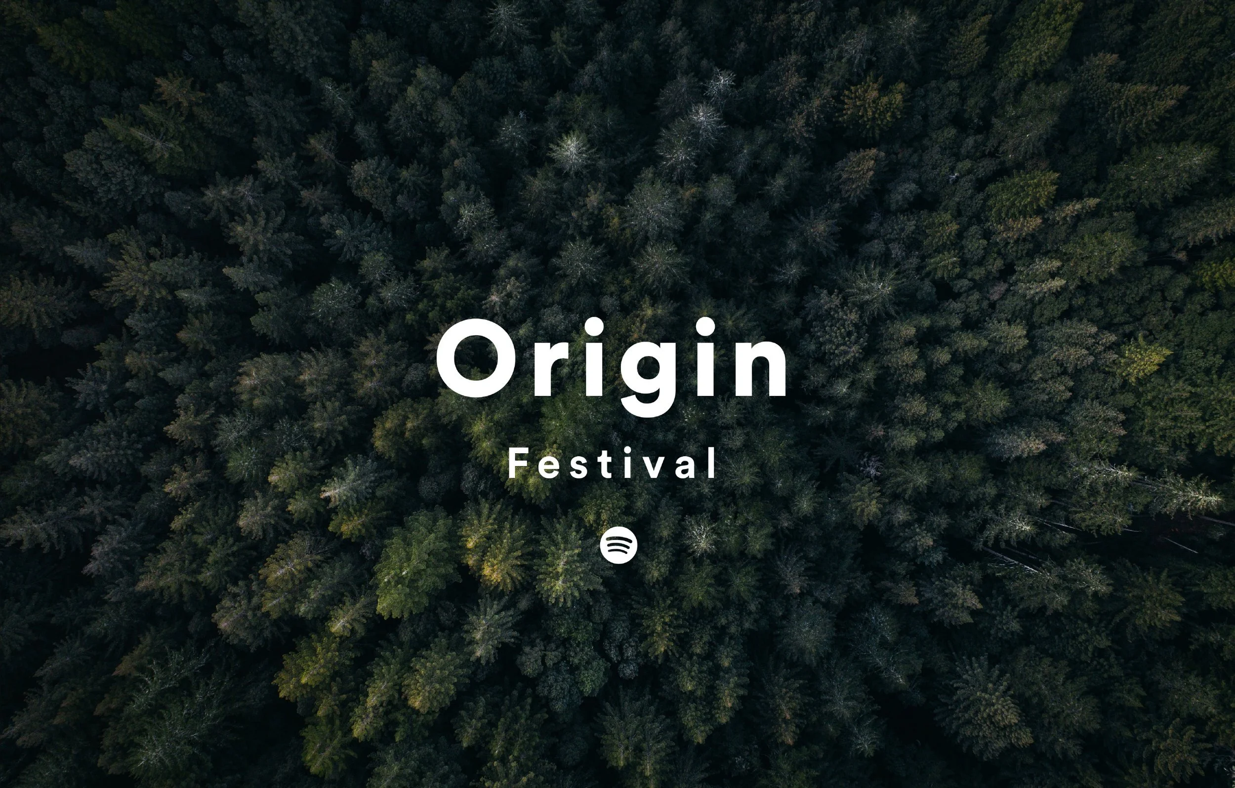
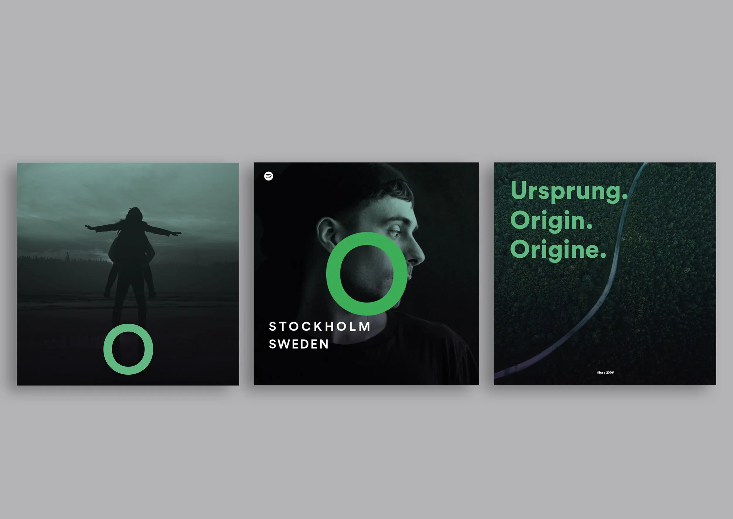
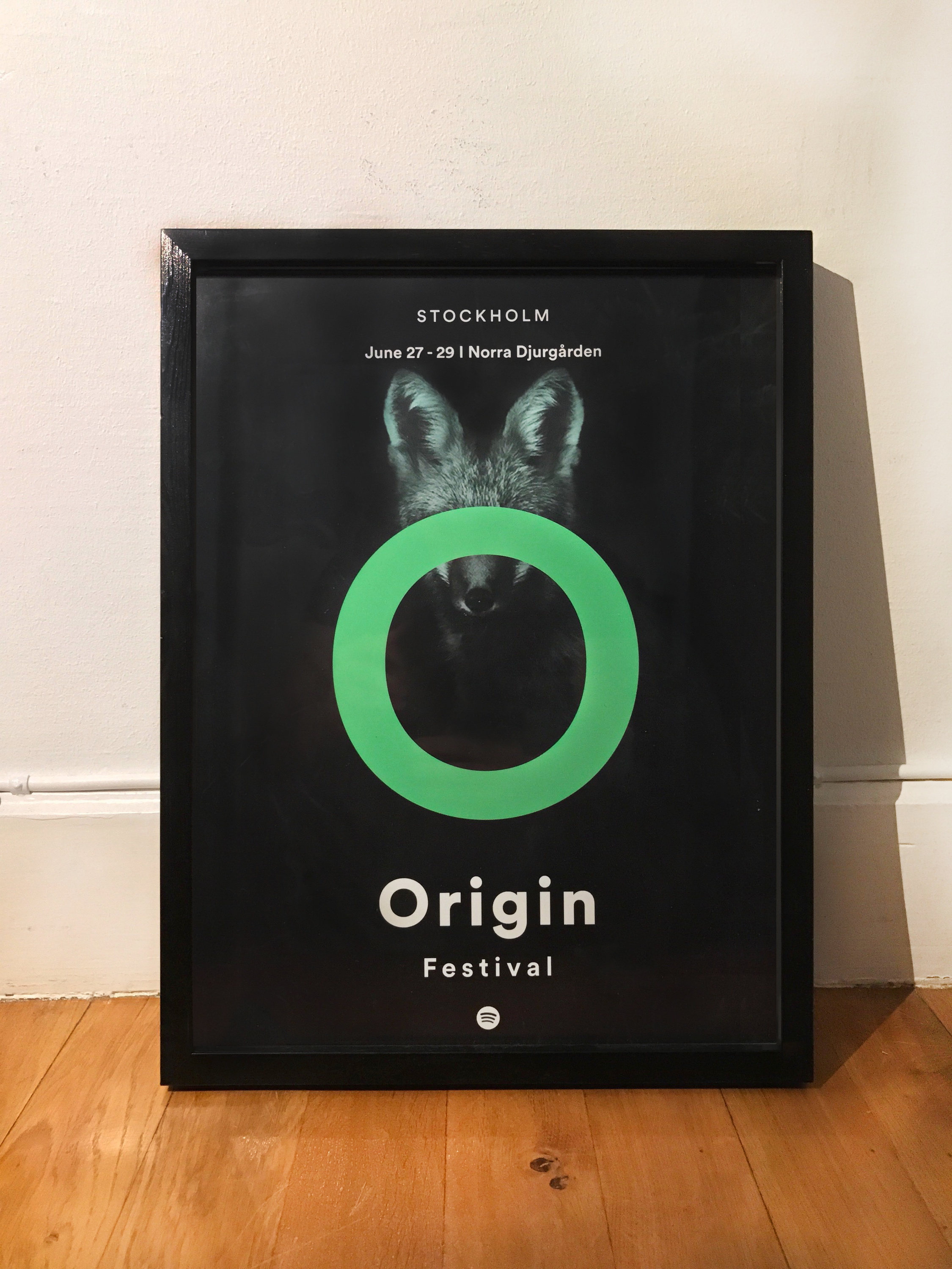
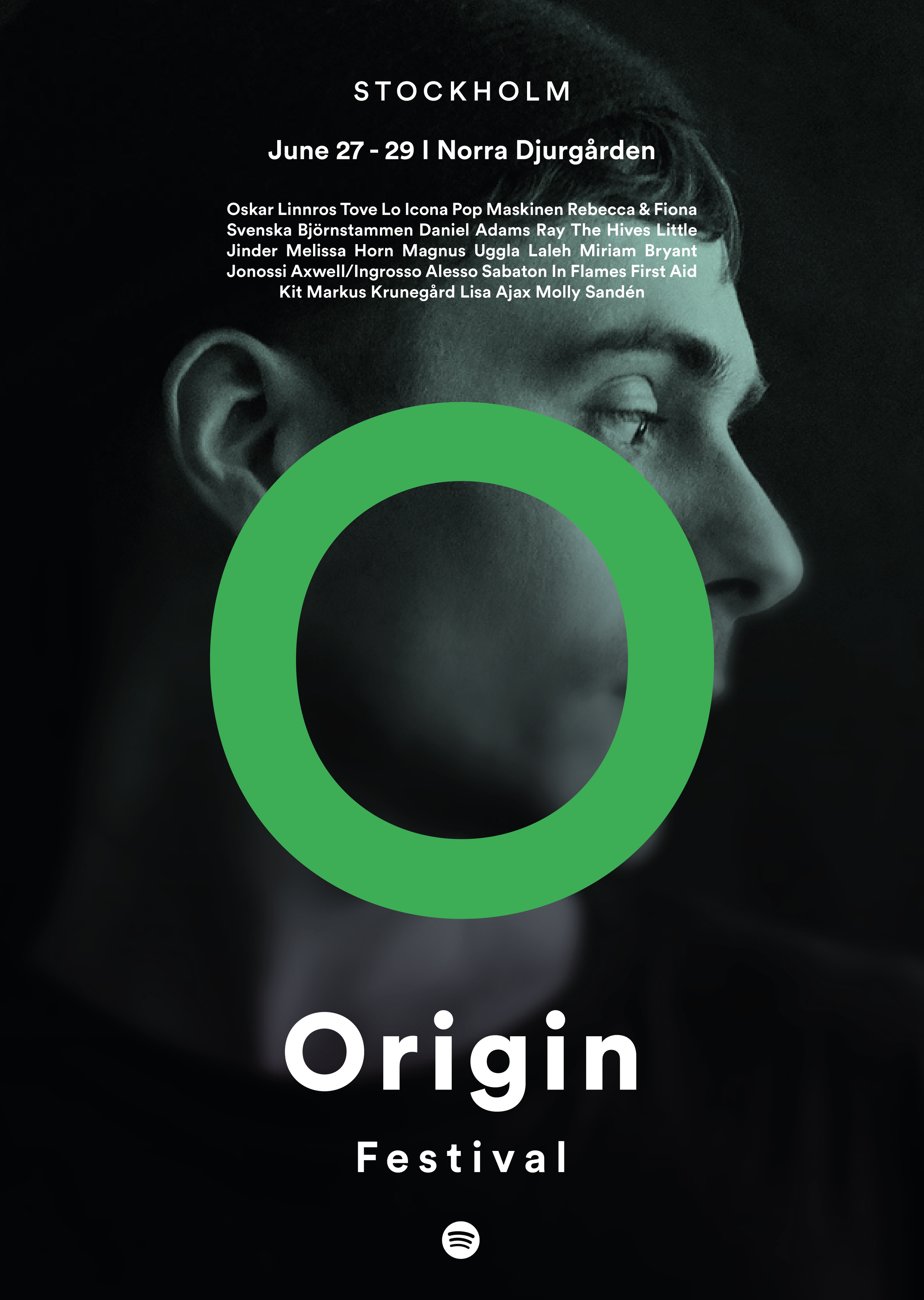
Spotify Origin Festival

Project: Origin Festival
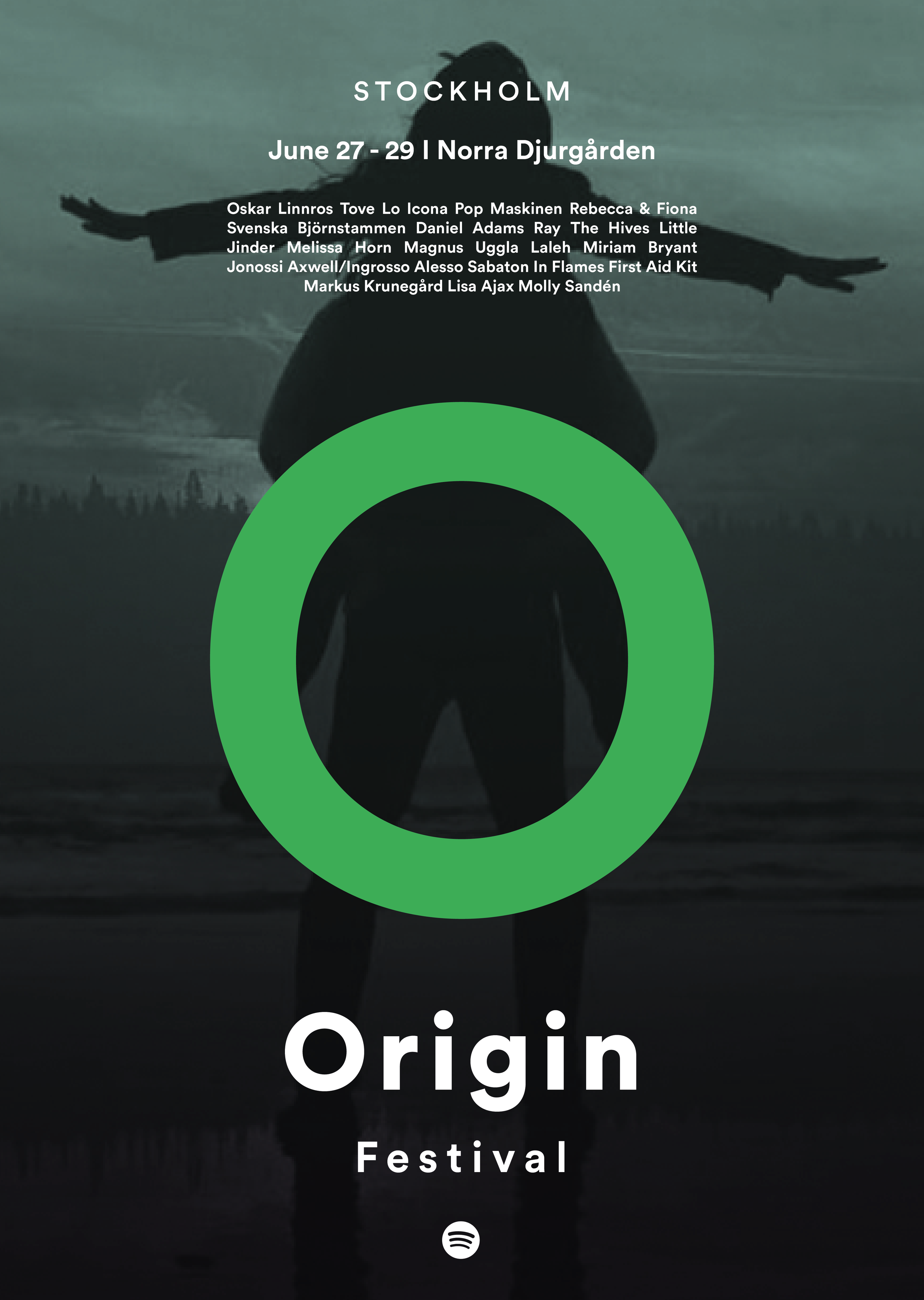
Client: Spotify
”We want to go back to the roots to find the origin feeling for Spotify’s first music festival”.
The idea was it’s Spotify’s first music festival and we want to base it on where it all started, from Spotify’s roots. The design is inspired from the beginning, when the only colours Spotify was known for were the green colour with the dark background.
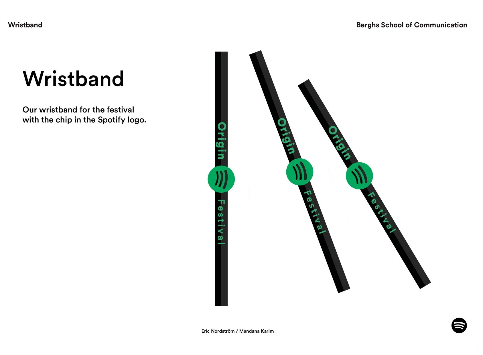
The ”O” is a symbol for the music festival, Origin.
I was part of a small graphic designer team.


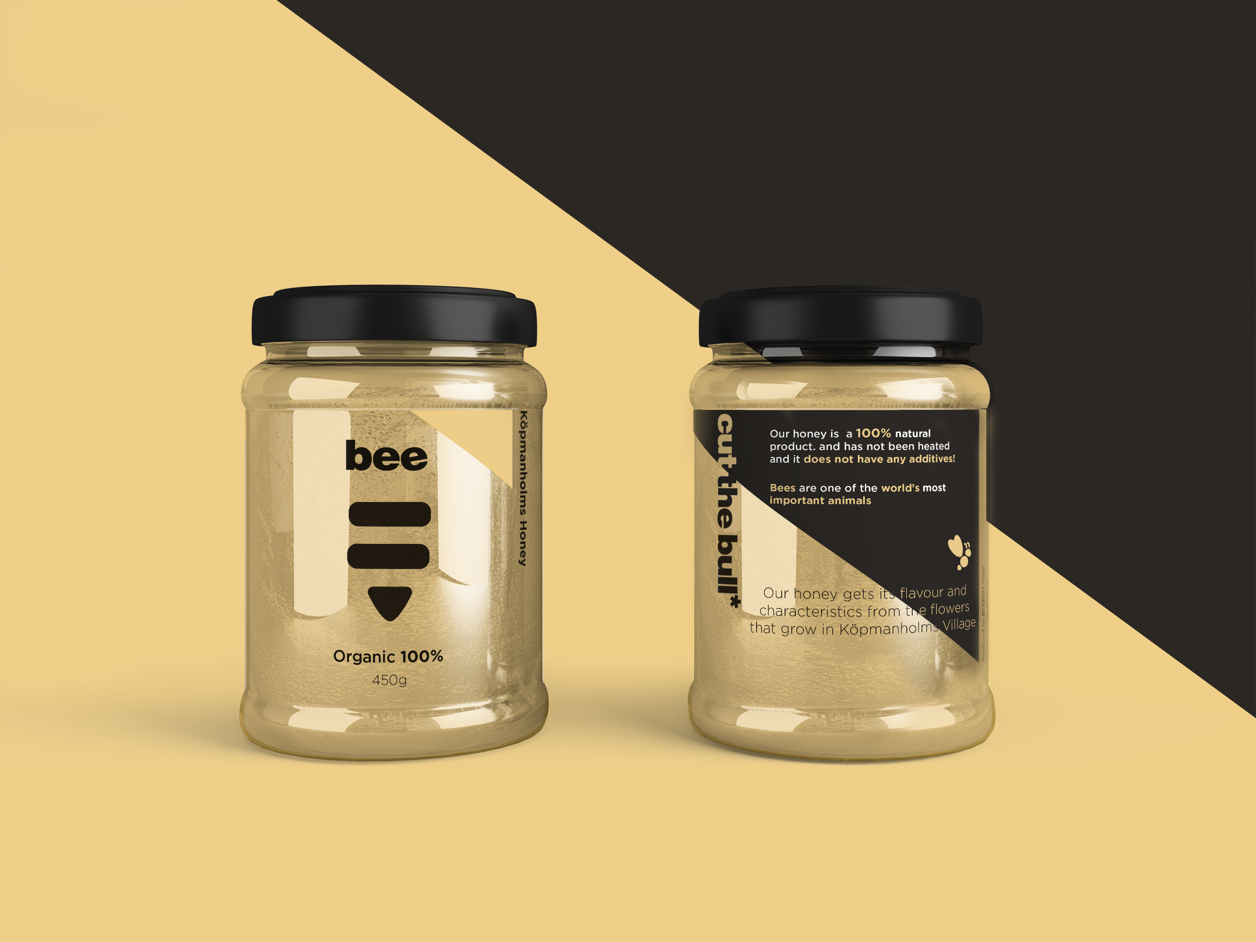
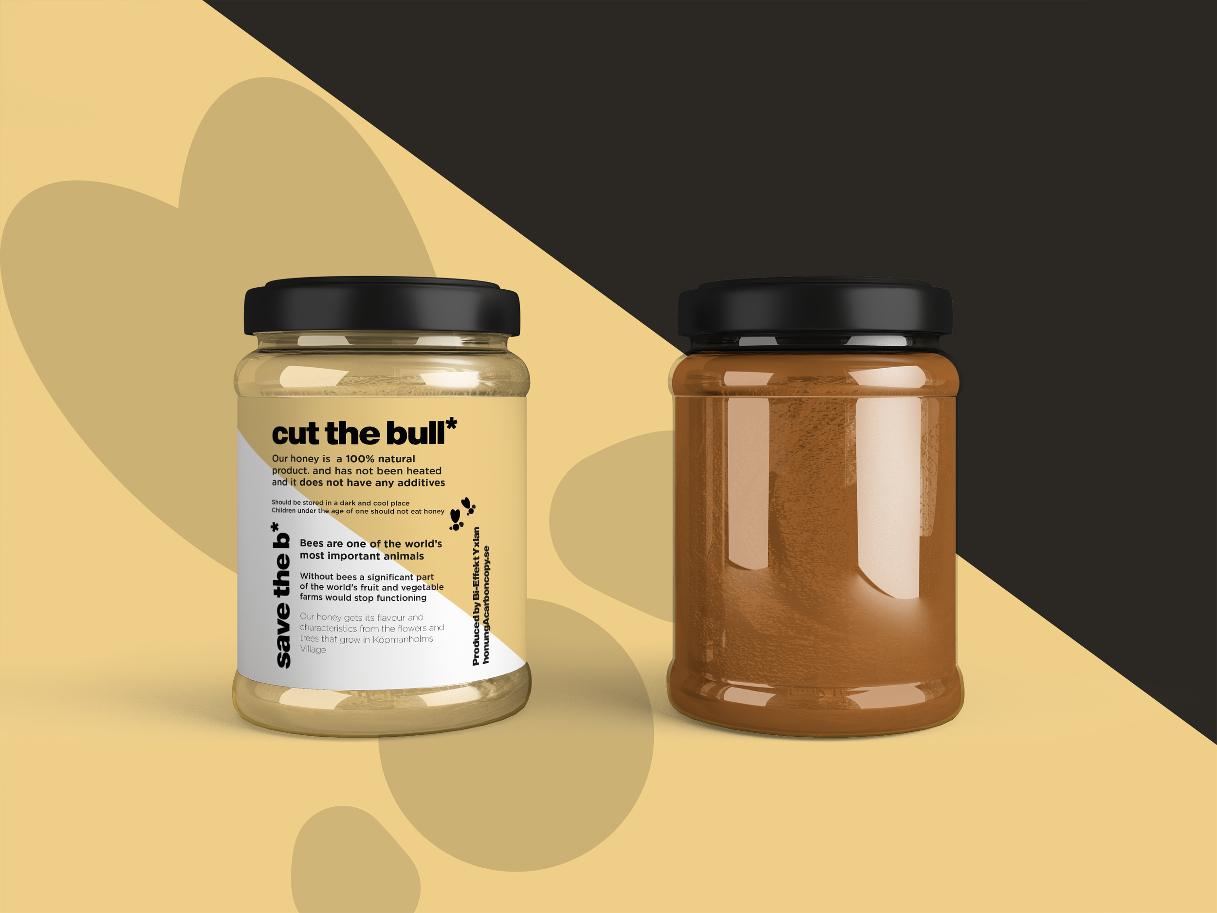
Project: Bee

Project: Bee
A Berghs School of Communication student project, re-branding packaging design and logo for a honey company.
The yellow colour speaks about the honey and the bees. A cheerful hue that brightens up the design.
The final result for the packaging design of “Bee”